
Documentation Index
Fetch the complete documentation index at: https://docs.brikl.co/llms.txt
Use this file to discover all available pages before exploring further.
Overview
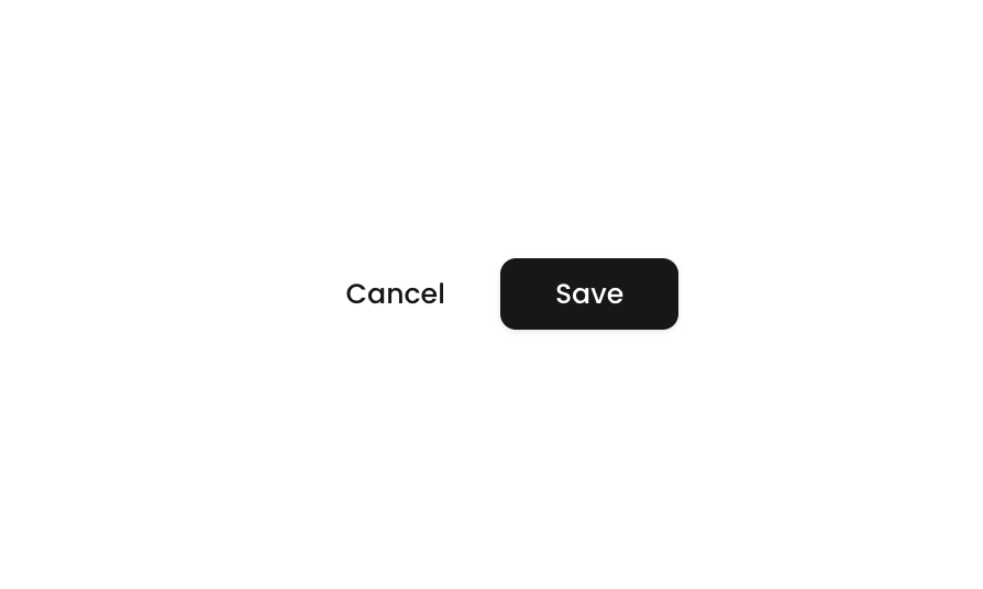
Button 10 is a ‘Cancel & Save’ action bar component containing two buttons arranged in a horizontal row. The Cancel button uses a light/outlined style with a left-arrow icon, while the Save button uses a dark filled style with a star icon. It is designed for form confirmation flows where users can either discard or commit their changes.How to use
States
This component includes conditional states that automatically change its appearance.| State | Trigger | Visual effect |
|---|---|---|
| Cancel Button Hovered | User hovers over the Cancel button | Background color changes to rgba(245,244,244,1) — a light gray tint |
| Cancel Button Not Clickable | Cancel button is set to not clickable | Opacity reduces to 50%, visually dimming the button |
| Save Button Hovered | User hovers over the Save button | Opacity reduces to 90%, slightly dimming the dark background |
| Save Button Not Clickable | Save button is set to not clickable | Opacity reduces to 50%, visually dimming the button |
These states are handled natively by Bubble and require no additional setup.
They will work automatically once the component is pasted into your editor.
Responsive
This component adapts to mobile screens. Font sizes and layout automatically adjust on screens smaller than Bubble’s built-in mobile breakpoint.Requirements
| License | Free |
| Plugins | None |
| Custom code | Not required |
Platforms
| Platform | Supported |
|---|---|
| Web | ✅ |
| Mobile | ✅ |
License
This component is available on the free plan.